Overview
In this article, we will review the rate increase leaderboard.
Rate Increase Leaderboard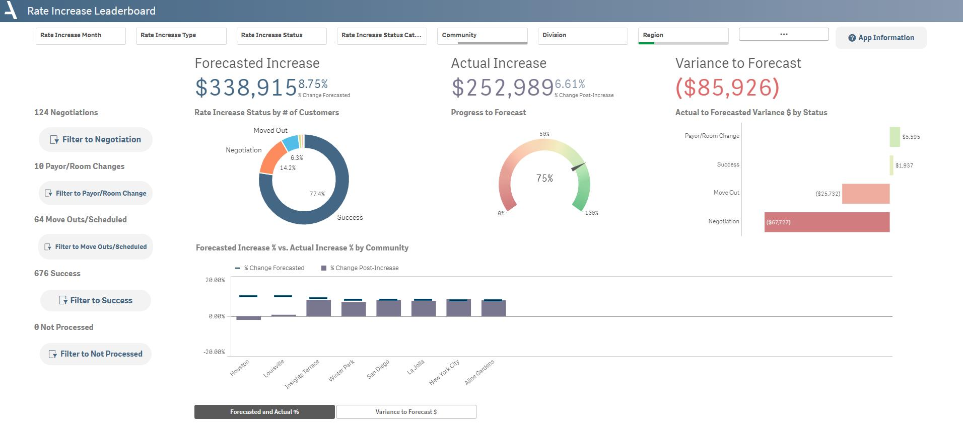
Keep track of progress towards goals, identify communities with significant variances, and gain an overview of increases by status.
- Understand the state of rate increase progress through critical KPIs, such as the variance between forecasted and actual increases, offering a clear picture of financial expectations versus reality.
- The filter buttons on the left-hand side enable focus on specific statuses to track rate increases and their effects on revenue as well as the number of residents.
- Observe community-specific progress towards the forecast, providing an at-a-glance comparison of forecasted and actual increase percentages across communities. This highlights areas requiring attention and enables targeted strategy adjustments.
Layout Tips
- The buttons along the left-hand side filter the app to different statuses in the rate increase process.
- The buttons along the bottom allow you to toggle the chart measure between the percentage variance and the monetary difference.
- Using the topmost filter pane, you can filter by rate increase month, type, status, and status category, in addition to the standard Insights filter options.
Questions to Get Started
How are we tracking towards targets for upcoming or past rate increases? Which status is costing us the most in future revenue?
- Use the filter pane at the top to select the Rate Increase Month(s) you would like to view. View the gauge chart in the middle of the screen to see Progress to Forecast or use the Variance to Forecast KPI at the top of the screen to see how your community or portfolio is tracking. Use the chart on the far right to determine which status is creating the most Variance to Forecast. In this case, residents negotiating down from the forecasted rate is the most common cause of lost revenue.
Which communities have the highest variance to their forecast?
- In the bottom chart, look for communities with significant gaps between the "% Change Post-Increase" bar and the "% Change Forecasted" line. Alternatively, toggle the graph to "Variance to Forecast $" and identify the right-most community to find those with the highest monetary variance. This community would be the one to focus on to recover lost revenue where possible or provide guidance for future rate increases.
Was this article helpful?
That’s Great!
Thank you for your feedback
Sorry! We couldn't be helpful
Thank you for your feedback
Feedback sent
We appreciate your effort and will try to fix the article