Overview
In this article, we will review revenue trends.
Revenue Trends
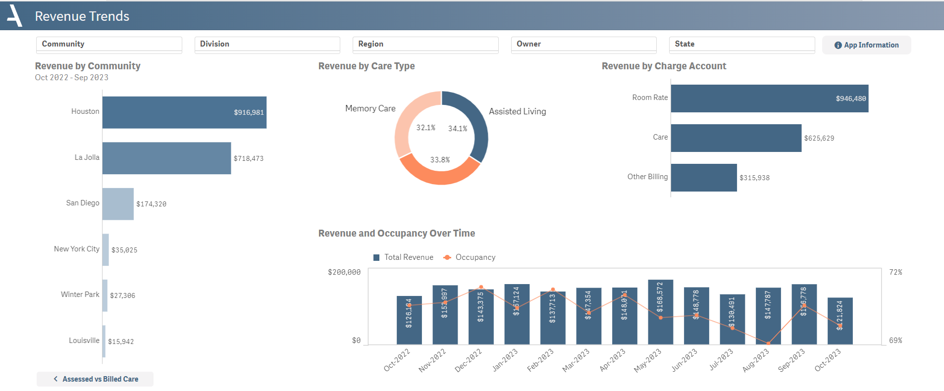
The Revenue Trends sheet offers a comprehensive view of year-to-date revenue across different parameters including building, care type, and revenue type.
- An initial bar chart provides a breakdown of revenue by community, allowing for easy comparison and spotting outliers.
- A pie chart presents an overview of revenue by care type, providing insight into the most revenue-generating services.
- The sheet further dissects revenue by charge account, such as room rate, care, other billing, and secondary care, using a bar chart.
- A combo chart showcases the trend of revenue and occupancy over time, providing a visual representation of their relationship and impact.
Layout Tips
- Revenue is combined with occupancy in the bottom graph to help indicate if revenue correlates to the number of people paying rent
Questions to Get Started
Which care type generates the highest amount of revenue?
- Refer to the Revenue by Care Type pie chart in the middle of the dashboard. The care type represented by the largest slice generates the most revenue.
Is our revenue experiencing an upward or downward trend?
- Look at the Revenue and Occupancy Over Time bar chart at the bottom of the dashboard. If the bars are consistently increasing in size, then revenue is trending upwards; if they're shrinking, it's trending downwards.
Was this article helpful?
That’s Great!
Thank you for your feedback
Sorry! We couldn't be helpful
Thank you for your feedback
Feedback sent
We appreciate your effort and will try to fix the article